My new friend Matt Baker of Vancouver, the Chart Geek, has drawn my attention to his disquisition on history timelines, examining remarkable examples of the genre from the 1700s to the present, and naturally culminating with his own labour of love, The Timeline of History.
I aimed to combine all of the elements that I liked in the five timelines I just introduced to you. I went with a vertical stream design like Hammond’s but kept the scale equidistant throughout like Adam’s. Like the Oxford chart, I decided to go with a poster format as opposed to a fold-out or multi-page chart. I started with an earlier date than most of the other charts (3000 BC) and, like Nothiger’s, consciously tried to include more on India, China, and Africa. Finally, like Sparke’s, I indicated the shifts in power balance by way of the thickness of each civilization’s “stream”.Well, labour of love, but not entirely. Matt would be delighted if you decided to order the timeline, very reasonably priced, from Amazon. As usefulcharts.com, in fact, he offers a wide range of, well, useful charts applicable to all sorts of teaching projects. I suspect he might take historical charting commissions too.
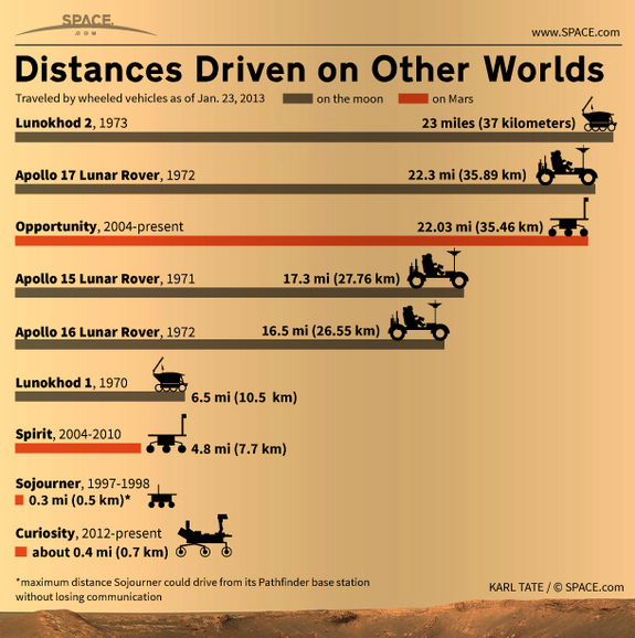
And if merely useful charts ain't cool enough for you, well, chartgeek.com is mostly devoted to "charts about space, sci-fi, and other geeky things." The "Space Rovers" chart, for instance, puts at your fingertips data about which exploration vehicles have travelled the farthest on either the Moon or Mars.